Explore the full case study ↓
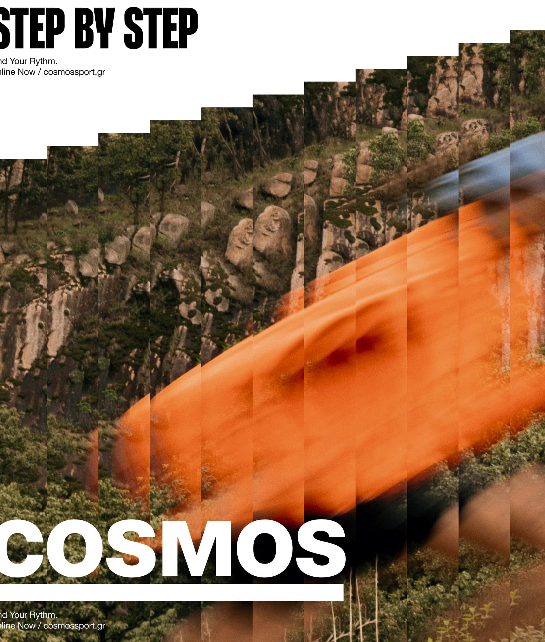
Celebrating the greatness of our small steps with Cosmos
Renowned sporting goods retail company, aspiring to establish consistent and scalable communication across channels. The new identity we created, including logo refreshment to optimize legibility and functionality, is orchestrated by the concept of rhythm as a reflection of the brand’s mission to motivate people to find their personal one toward change.
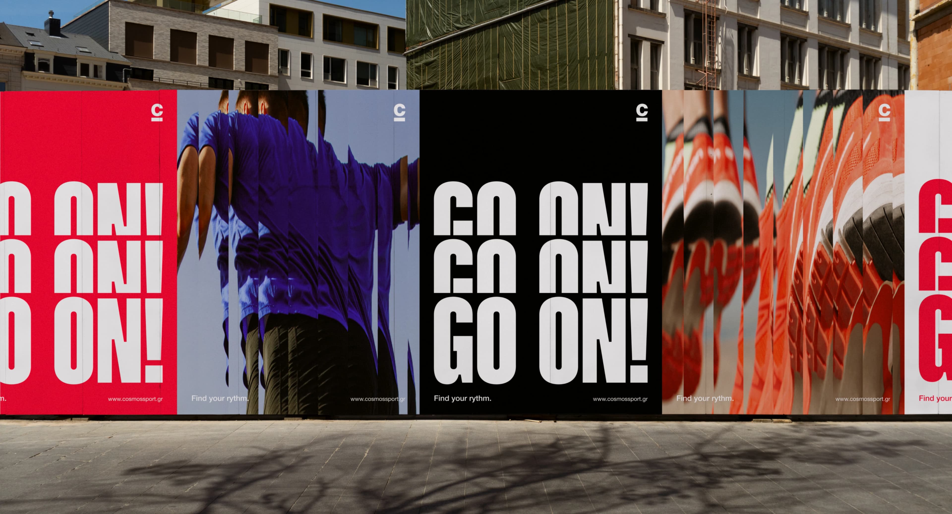
Brand Build On Repetition & Motion
Logotype Redesign
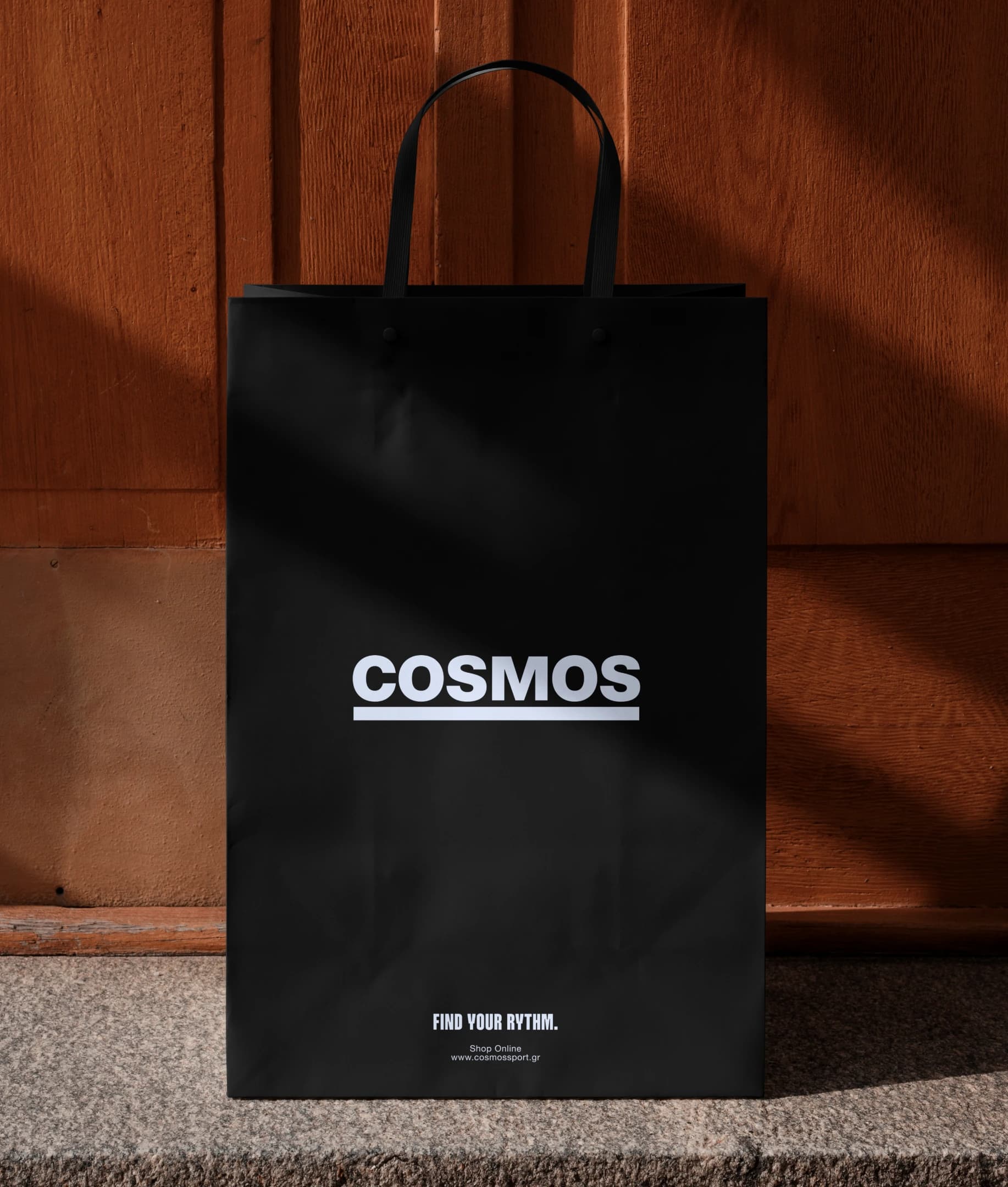
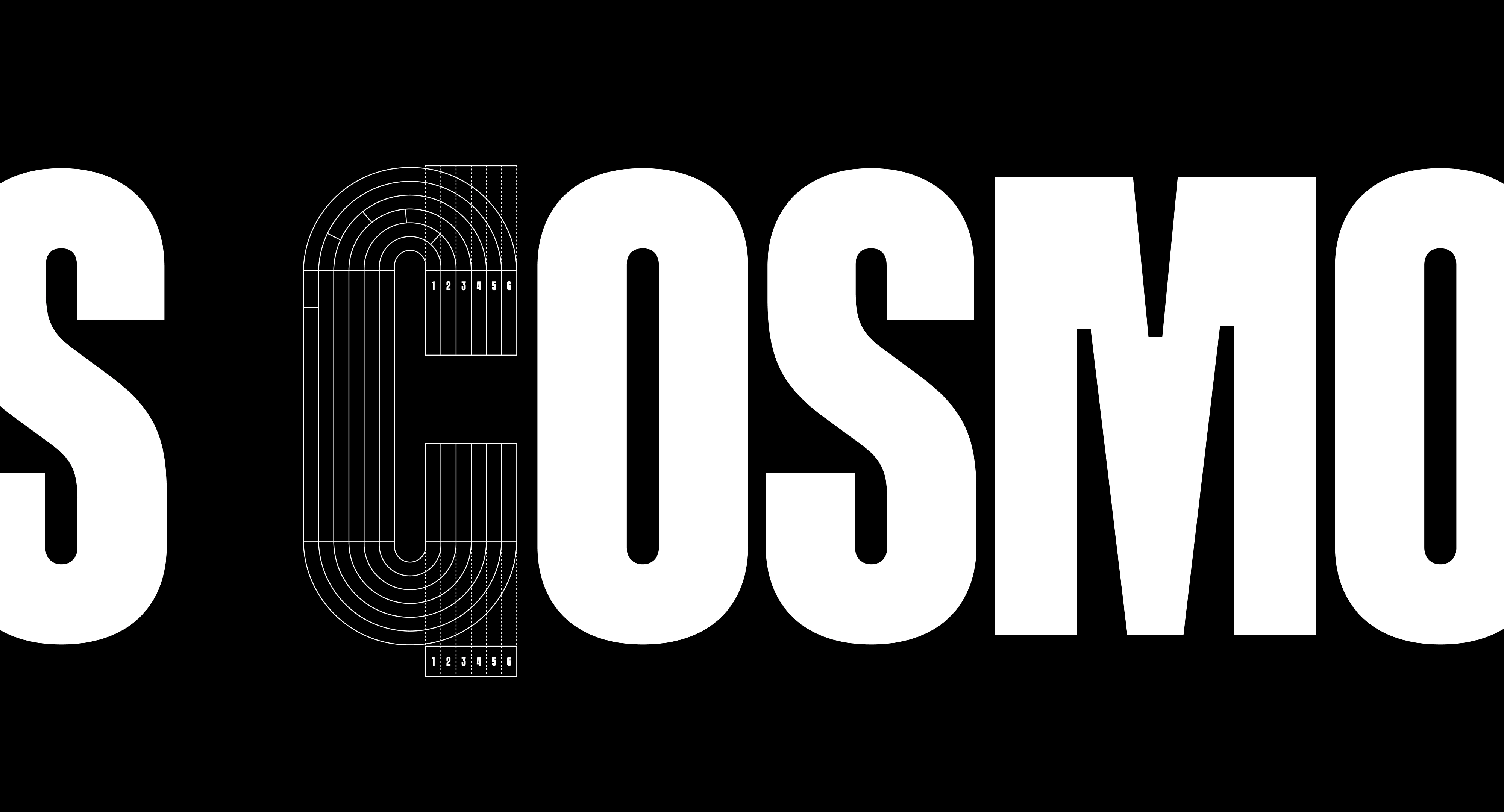
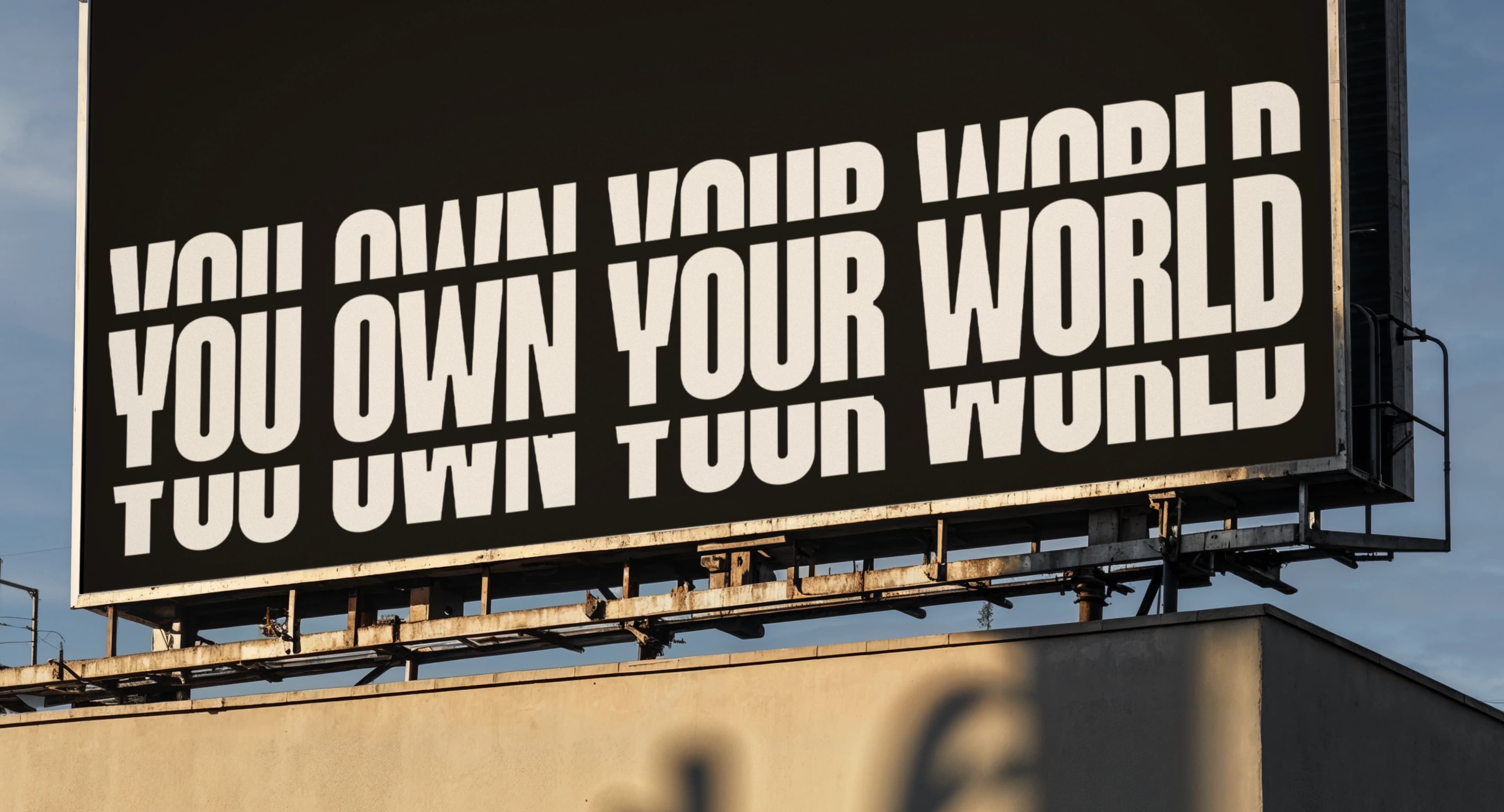
The Cosmos logotype was refreshed to enhance clarity and adaptability across platforms. By removing the descriptor and refining the underline, we focused the brand’s visual presence while preserving its recognizability. A cleaner, bolder wordmark that follows the brand's rhythm, and leads it.
Brand Narrative
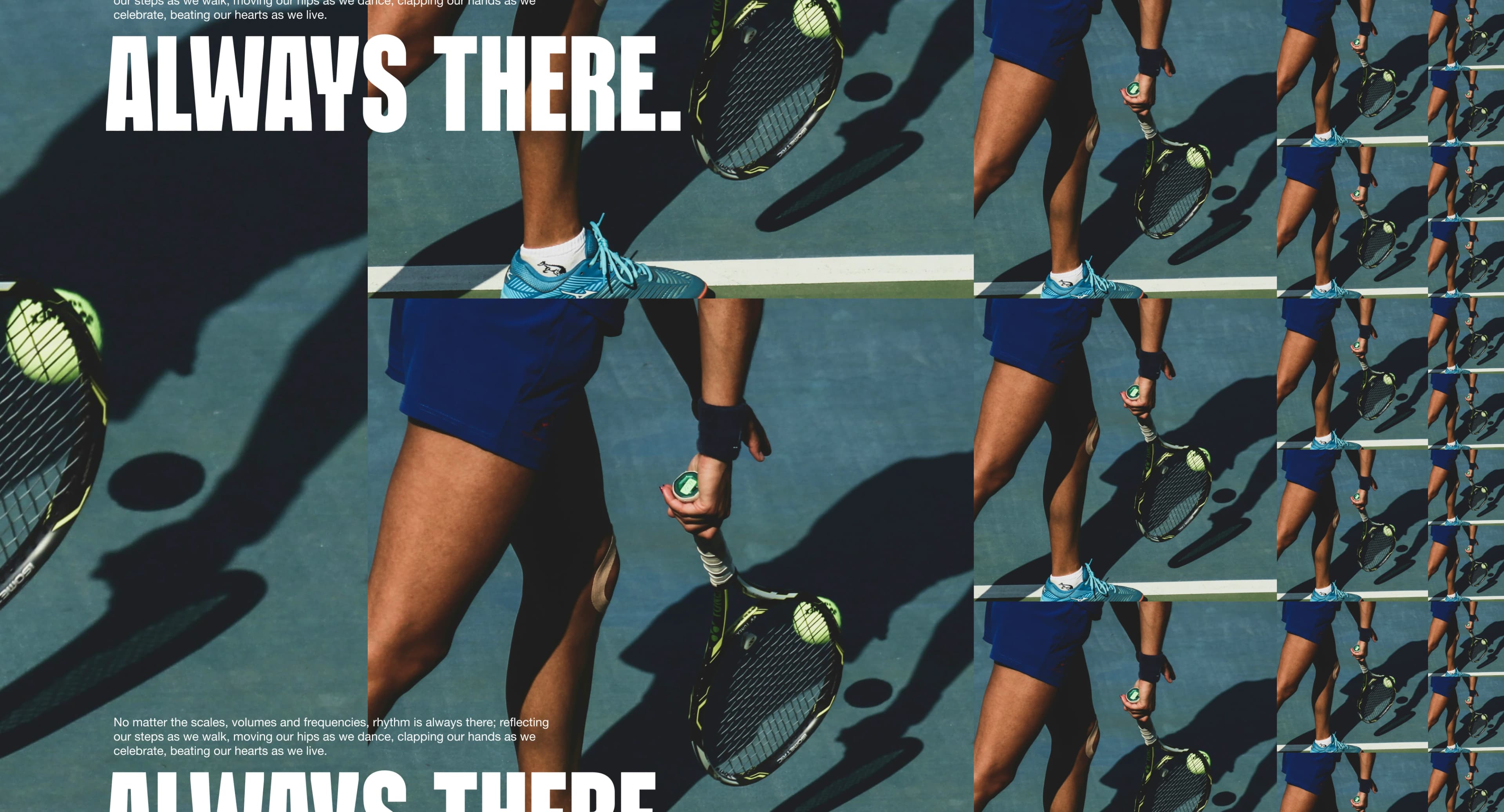
The brand story is inspired by the tempo of real people, their start, their effort, their progress. Through a tone that celebrates inclusivity, commitment, and expression, the new Cosmos Sport identity speaks the language of action, with versatile brand assets that grow and adapt to every moment of the day.

Custom Typeface | Cosmos Sans
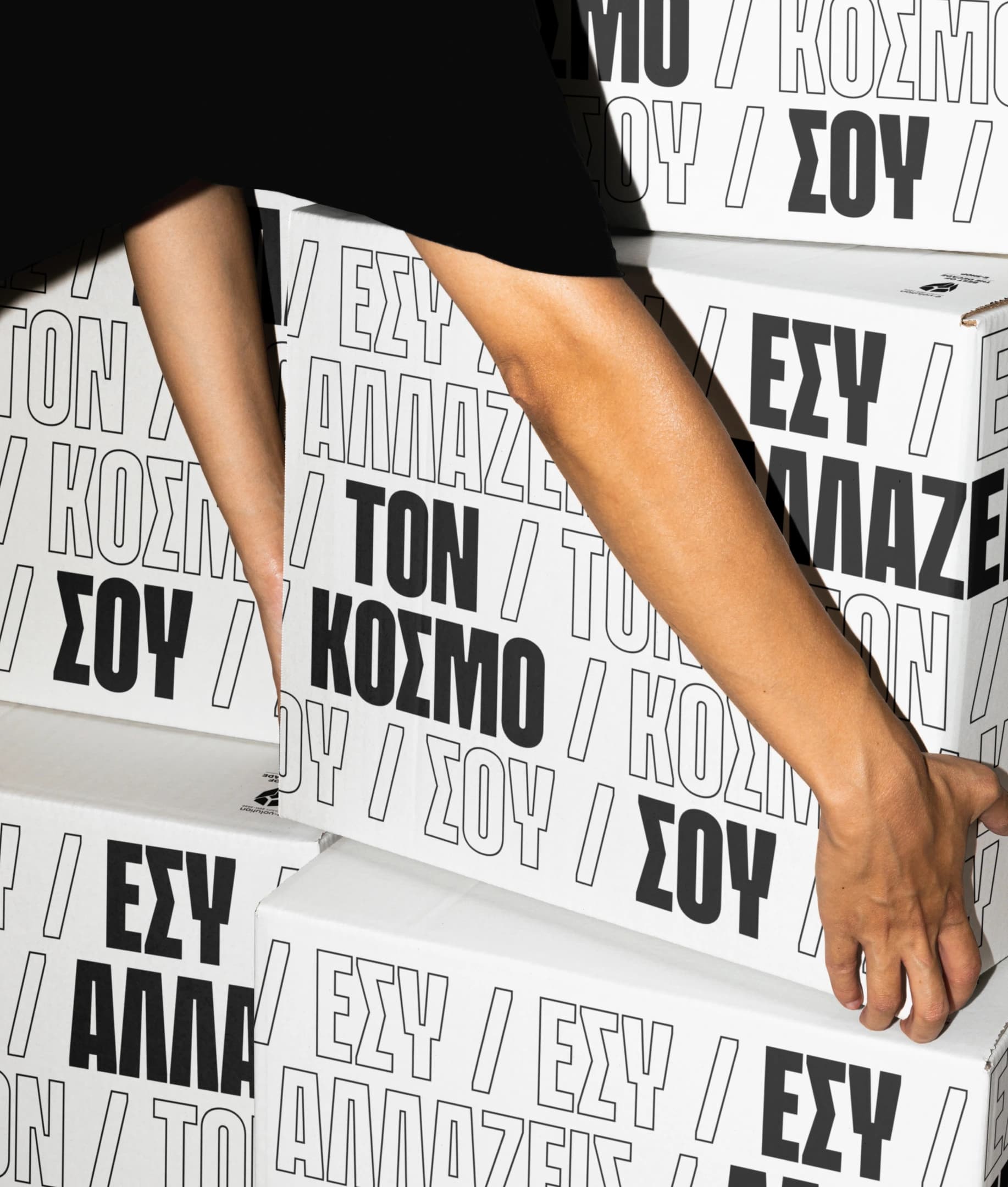
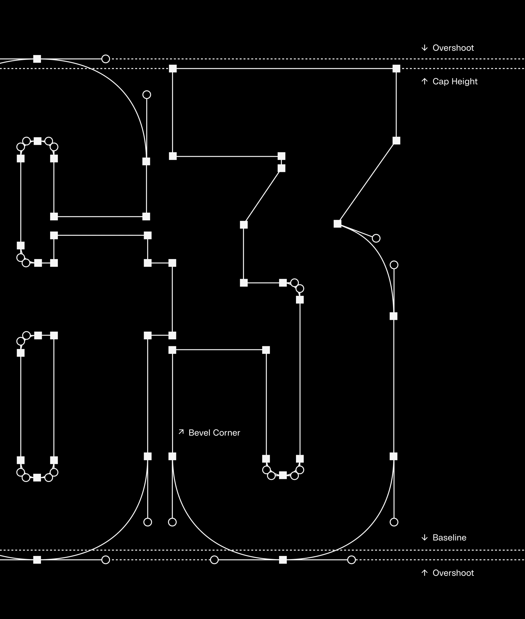
Cosmos Sans is a custom typeface inspired by athletic lettering found on jerseys and sports gea, bold, legible, and full of energy. Designed in both Latin and Greek, it empowers Cosmos to communicate in a consistent, rhythmic, and inclusive voice across all media.
Iconography
Designed to complement the brand’s dynamic tone, the custom iconography system adds clarity, movement, and expression to every touchpoint. Optimized for performance both online and offline, it supports the daily journeys of all Cosmos customers, clearly, confidently, consistently.
Brand Implementation
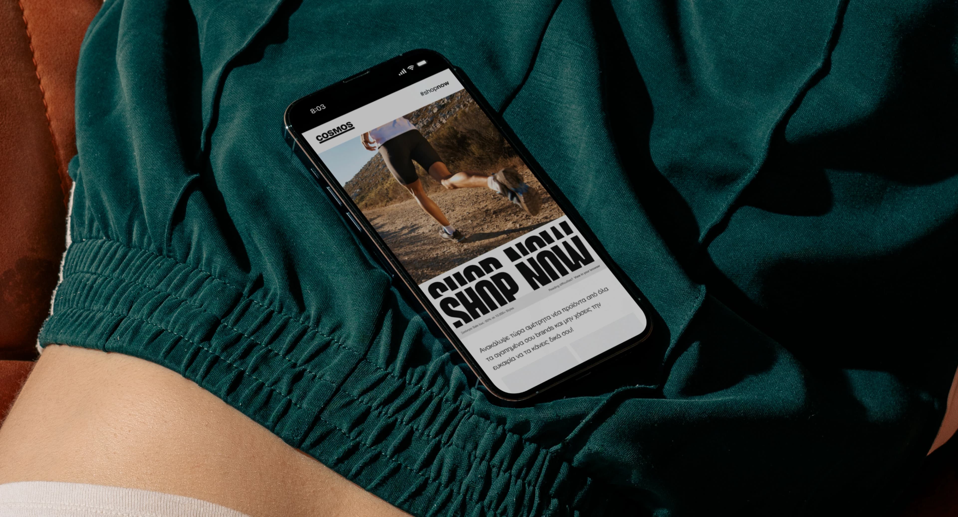
From flagship stores to online interfaces, every brand asset was designed to be flexible, intuitive, and impactful. The Cosmos identity system adapts seamlessly across retail, digital, and print, ensuring a unified experience that moves with people, wherever they go.